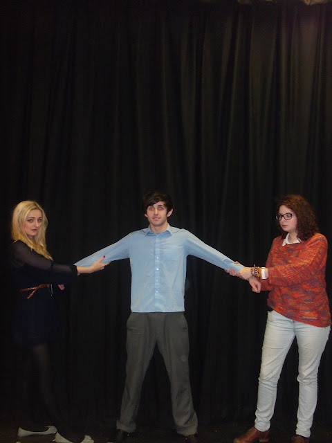
Here is the chosen photo that I have decided to use as the main image for my promotional package on my film poster. When taking this image, I knew exactly the kind of image I wanted to create in my head and it was just a case of getting that image from my head into reality and creating an image that I know would look effective on my film poster and really create a professional outcome that would lure audiences in to want to go and watch my film in the cinema. When creating the setting for this image, I wanted to show to the audience where the film is going to take place and give an insight as to what the film may be about which is what I think the black curtain does effectively. It shows to the audience that this film may be about a show because you often get black curtains on a stage before the show begins and the audience might get a vision of the curtain opening to reveal the beginning of a show with these three characters involved in some format.
With regard to the characters themselves, I really wanted to create the scenario where the two girls, Millie and Miranda were fighting over the really good-looking, popular boy, Greg and I feel I have acheived this well in that the audience would really be able to understand that even though the storyline is about auditioning for a school show, it also has a sub-plot too in that the two girls not only want the main part in the school show, but they also want to go out with the most popular boy in the school and through the two girls grabbing onto Greg's arms, in a sense wanting him for their own, they really bring across this idea to the audience. The costumes of the characters also help to bring this characterisation across the audience as Millie is wearing geeky glasses and her stance is quite frumpy whereas in complete contrast to this, Miranda is looking flawless with beautiful clothing, hair and make up, as you would expect from a popular girl and the fact that she is pouting into the camera suggests that she is very comfortable in her own skin and that she is used to being infront of the camera. In this way, I feel I am following the codes and conventions of a typical film poster, especially that of a romantic comedy.


No comments:
Post a Comment