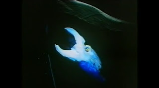
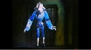
The Sandman is a 1991 stop-motion animation film, animated and directed by Paul Berry and nominated for an “Oscar” for Best Animated Short Film in 1992.

At the beginning of the film, there is an establishing shot of where the sandman lives. There is also non-diagetic sound of music being used which builds up tension and creates an uneasy atmosphere within the audience as they become curious as to where this place is and what is going to happen throughout the short film. Immediately through this establishing shot, the audience automatically know that the setting isn't pleasant, the colour scheme used is mainly blue which gives off a cold, distant effect which allows the audience to realise that the character who lives in this setting will to, not be very pleasant. This sets the audience up for the rest of the film and the events that will occur.

The use of the blue font on the black background for the title of the film creates a very cold, frigid, icy and uneasy atmosphere and there is automatically a connotation of what the colour blue represents and this could allure what the character of 'The Sandman' may be like. The use of the non-diagetic sound as the name of the short film comes up can be described as short, sharp, scratching as if someone is using their nails to scratch ice. Once again, this represents a cold and distant atmosphere that the use of the colour blue acheives. The sounds used also builds up mystery within the audience as they are building up a picture of what the Sandman may look like and want to see if their predictions are correct.

The camera then cuts and zooms into the clock in the living room. All of the diagetic music in the background then stops so that the entire focus of the camera is on the clock. This is significant as it is obvious that the clock is important in this stage of the short film and it builds up tension and suspense within the audience as they are going to be curious about what is going to happen next. The only sound that can be heard at this point is the ticking of the clock and the banging of the creature that comes out of the clock. The creature that comes out of the clock is quite haunting and scary and this once again would create an tense atmosphere which is heightened by the use of sound. It is possible to tell that the clock is detrimental in this scene as the rest of the mise-en-scene is in darkness apart from the clock which appears to have a spotlight of some sort shining on it, again emphasising its' importance.
This still uses a close-up of the child's face to really emphasise his fear and how scared he is of going up all of those stairs to his bedroom. The use of the close-up is used to show his facial expressions and to get across his feelings and emotions through these facial expressions. This enables the audience to truly sympathise with the character.
This is a high-angle shot that is filmed from the staircase to show how far the child has to walk up to his bedroom. This shot also makes the boy appear very small and minuscule which emphasises his naivety and how scared he is to walk up the stairs and the camera shot also shows how daunting and giant-like the stairs are compared to the child, there is a huge contrast. The facial expression of the child also shows his fear and the audience may sympathise with him at this point.
These three stills all involve a canted angle being used. This adds distortion to the scene and creates a spooky atmosphere that builds up tension and suspense within the audience as this distortion adds to the colour schemes and the sound technique that builds up to add to the scary and spooky themes. The first still shows how far the boy has to walk up the stairs to his bedroom and is again a high angle shot to make the child look inferior and naive. The second still shows the child almost at his bedroom and the hallway is distorted and canted again to show that everything is not as it seems and the audience would begin to be curious at what is going to occur. The third still shows the child's bedroom in a canted manner. The use of the dark colour through the window emphasises the bed in the room as the rest of the room is in darkness.
This is the first view of the Sandman himself as it appears that it is actually the moon in the frame of the scene. However, all is not as it seems as The sandman is revealed. The use of the black background emphasises the important of the image of the Sandman and the image is very frightening and daunting and follows the scary and spooky theme that is constant throughout the short film. There is iconography of the moon throughout the short film and the motif of the moon features regularly.

This is an big close-up of the child's face here to show his facial expressions. It is clear that there is sheer fear in his face and he is extremely scared. The audience would truly feel sorry for him here and sympathise with him. Tension and suspense would also be building here as the audience knows something is bound to happen.
This is first full view of the Sandman that the audience sees. A long shot is used so that the audience can see what he looks like from head to toe. Immediately, this character gives off a scary and terrifying persona to the audience and they would most likely fear him. He is portrayed as the villainous character whereas the child is portrayed as the victim character who is completely innocent and naive. There is a huge contrast between the two characters here and the audience know something bad is going to happen and that the Sandman is going to do something to the child, this builds curiosity and the tension rises and rises.


No comments:
Post a Comment