
Wednesday 29 February 2012
Tuesday 28 February 2012

Film Poster Progress


¢Image 2 shows my image on landscape format for the first time.
¢I have also changes the style of my actors and actresses names at the top of the page. I have done this because when researching film posters, I noticed that it was normally the surname that stood out the most and was bigger than the first name. I also noticed that the surname was always in a bold font whereas the first name was often more subtle, smaller and in a nicer font.
¢Also, I have developed the creation of my film name and I did this by searching through websites such as http://www.dafont.com/ and http://www.fontspace.com/category/magazine . These websites were really useful because they allowed me to create fonts and use colours that I wouldn’t have been able to use on publisher, which is what I was creating my film poster on. I really like the style use for ‘SPOTLIGHT’ as I think the stars in the name are really effective because it gives an insight into the title of the film and why it is called what it is and this then alludes to what the film might be about and what the storyline might entail.
¢I have also started to construct my small font that includes all the actors and actresses names, the directors, the producers, all the people that have worked on the film and the production company that the film is associated with. I managed to create my own by researching what is included in the small text on existing film posters and we also have some posters on the walls in the media room and so I looked the these for inspiration and research which really helped.
¢In the third image, I have taken off the certificate that was in the second image. I have done this because me and my teacher discussed and decided that the film poster would look better without it because it was distracting from the film poster itself and the message it was portraying. I was encouraged to do this because I noticed that some romantic comedy film posters also don’t incorporate the certificate either.
¢I have also changed when the film is coming out from ‘July’ to ‘In Cinemas July’. I have decided to this because my media teacher advised it would be better to put ‘in cinemas’ and I agreed with her because then my audience will know exactly when it is in cinema rather than just saying ‘July’ and so using ‘In Cinemas’ certifies when the film is actually coming out.
¢I have finally added comments from pundits and those who have already seen the film and reviewed it. I added comments such as ‘Best Film of the year!’ because I found this to be quite common when researching film posters. Also, the audience will see the others have seen the film and really enjoyed it, which could persuade and lure them in to go and see it.

Thursday 23 February 2012
Film Magazine Front Cover Progress


Here are the stages I went to in improving my magazine. The second image was originally going to be my final product but me and my teacher discussed ways to improve it and so I spent time re-doing parts of my magazine and I think it looks so much better in the third image compared to the second. However, I feel if I had more time then I could have further improved it as it isn't the strongest magazine front cover.
Wednesday 22 February 2012


Thursday 16 February 2012
Editing Process
Whilst I have been researching film posters, film magazines and creating my own ancillary products, I have also been editing the film with Andrea on Adobe Premiere Elements.
Tuesday 14 February 2012
Film Magazines Research

Here, I have been researching into front covers of film magazines as I will be creating an ancillary product that involves making a film magazine front cover for my film. I have researched mostly EMPIRE and TOTAL FILM as these are the 2 most successful film magazines. I have paid particular attention to the way the main images are constructed and placed on the front page and I have also looked at the masthead of the magazines, how it stands out and the colour scheme. Also, I paid attention to all of the other films that are mentioned on the front cover and also how the magazine front cover allures people in to want to buy the magazine through the main image and the colour scheme.
Monday 6 February 2012
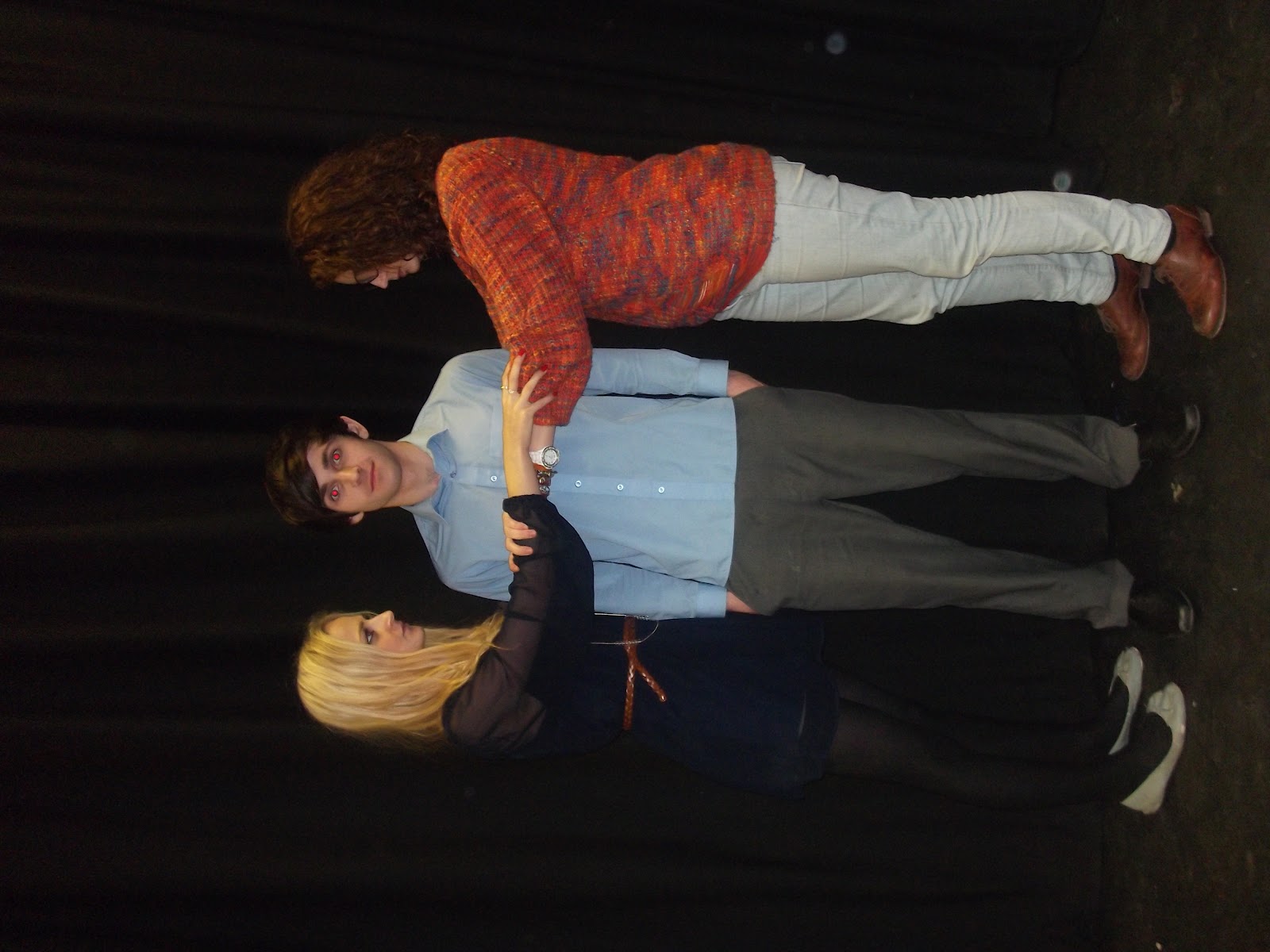
The chosen photo for film poster


Here is the chosen photo that I have decided to use as the main image for my promotional package on my film poster. When taking this image, I knew exactly the kind of image I wanted to create in my head and it was just a case of getting that image from my head into reality and creating an image that I know would look effective on my film poster and really create a professional outcome that would lure audiences in to want to go and watch my film in the cinema. When creating the setting for this image, I wanted to show to the audience where the film is going to take place and give an insight as to what the film may be about which is what I think the black curtain does effectively. It shows to the audience that this film may be about a show because you often get black curtains on a stage before the show begins and the audience might get a vision of the curtain opening to reveal the beginning of a show with these three characters involved in some format.
With regard to the characters themselves, I really wanted to create the scenario where the two girls, Millie and Miranda were fighting over the really good-looking, popular boy, Greg and I feel I have acheived this well in that the audience would really be able to understand that even though the storyline is about auditioning for a school show, it also has a sub-plot too in that the two girls not only want the main part in the school show, but they also want to go out with the most popular boy in the school and through the two girls grabbing onto Greg's arms, in a sense wanting him for their own, they really bring across this idea to the audience. The costumes of the characters also help to bring this characterisation across the audience as Millie is wearing geeky glasses and her stance is quite frumpy whereas in complete contrast to this, Miranda is looking flawless with beautiful clothing, hair and make up, as you would expect from a popular girl and the fact that she is pouting into the camera suggests that she is very comfortable in her own skin and that she is used to being infront of the camera. In this way, I feel I am following the codes and conventions of a typical film poster, especially that of a romantic comedy.
Friday 3 February 2012
Photos for my ancillary products
Today, I took some pictures for my film poster. These are the images that I produced. I wanted to create images that were striking and that would lure the audience towards the film poster, be interested in what the film is about and therefore they would be pursuaded to go and watch the film. With the pictures, I wanted to create a scenario that would be included in the film and I wanted to get across the idea of characterisation and how each character could be perceived through their stance and pose in the images. I wanted Greg in the middle because obviously he is the main 'prize' that the two girls are fighting over. They want the main part in the school show so that they can be closer to him and spend time with him as well as getting the coveted main role in the show. I have illustrated the two girls desperation to spend time with him through this pose as they are both grabbing onto his arm, to connote that they both want him and that they're fighting over him. Also, through the use of the costume the audience would be able to know that the two girls are not from the same sort of friendship groups within the school and the use of the geeky glasses show to audience that Millie is the geeky girl. Through the pose that Miranda is making and how flawless she looks from her make up to her dress sense, the audience know that she is the popular girl. The mise-en-scene of the pictures are took were all in the school hall, where the show would take place if it was a real life situation and I think the use of the curtain in the background gives an idea of what the setting of the film is and where it is taking place and so I think that the use of the black curtain in the background is effective as it lets the audience grab an insight into what the film might be about and it also allows the characters in the picture to stand out infront of this black curtain.


Wednesday 1 February 2012
Subscribe to:
Posts (Atom)