Tuesday 31 January 2012

Date Night Film Poster


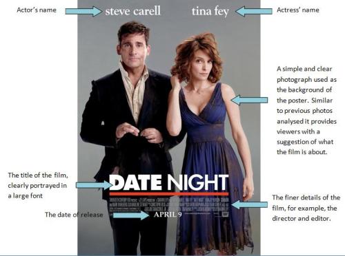
As clearly seen from this poster there are many key features that are often reflected in the majority of film posters. For example, the two main protagonists are featured in the poster, with their names clearly labelled above them. The font is large and of a contrasting colour to the background ensuring the viewers easily notice who is featured in the film. It is often the case that people are more likely to watch a film if big hollywood stars are featured and thus their names are often clearly portrayed on the poster. Similarly, the background is a very simple posed photo, yet the way in which the characters are featured gives a slight suggestion as to what the film will be about. For example, it is obvious that the couple will get into some form of mess during the film which can easily be depicted via the dirty state of their clothes. The title is clearly a very important part of the poster as it is shown in a larger and bold font, making it stand out from the background. Details of the director and editor are also featured in a smaller font as to audiences, this may not necessarily be the most important feature of the poster. Finally, the release date of the film into cinemas  is clearly shown, a very important feature for audiences.
Monday 30 January 2012

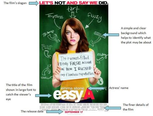
Easy A Film Poster


Similar to the posters analysed below this poster has a simple background, a slogan, the name of the protagonist, a large title and a release date.It is obvious to see from the background that the film is a comedy and obviously centres around a girl in a school, as depicted by the traditional blackboard used as the background. The piece of paper the girl is holding also clearly gives a suggestion of what the film is going to be about. At the top of the poster is a slogan in a bold red font which clearly reflects something to do within the film. Above the once again large title of the film is the actress’ name; obviously a very key feature. Similarly, the details of the director and editor and so on are placed in small font at the bottom of the poster, with the release date in clear red font enabling it to stand out from its background.
From analysing these three posters it is clear to see that there are many conventions:
  • A clear and simple background, usually a posed photo of the protagonists which helps to highlight the character’s personalities and reveals hints about the plot of the film
  • The names of the actors and actresses are clearly shown above the images of their characters
  • The title of the film is often in a very large and bold font so that it stands out from the background
  • There is sometimes a slogan/tag line, again giving an insight into the film
  • The release date of the film into cinemas is clearly shown
  • There is information about the film company, the director, the editor and so on

Sunday 29 January 2012

No Strings Attaches Film Poster


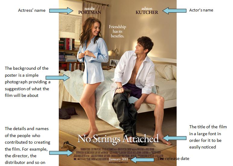
‘No Strings Attached’ film poster is very simple yet obviously portrays that the film is about a man and woman who are friends in some form of intimate relationship. The actor’s names are obviously shown at the top of the poster above each of their characters in a clear and large font. Audiences may be immediately attracted to the film once the actors names are noticeable as they are often well recognised stars. Similarly, the film’s slogan is placed close to the centre of the poster, drawing the eyes instantaneously towards it. A film’s slogan should always provide a suggestion of the film’s plot, and if in this case, the film is a comedy, the slogan should have a touch of humour. The title is also portrayed in a clear and very large font, again demonstrating the importance of it with regards to the other features on the poster. As well as the details of who helped to make the film, for example, the director and editor, the release date is shown towards the bottom of the poster.

Friday 27 January 2012

Research into romantic comedy film posters

Today, I have started to look at what romantic comedy film posters look like, how they are devised and their layout is created. I have created a collage of all the romantic comedies I have looked at so I can see common themes between them all that I can then take and interpret into my own film poster.

Analysing one romantic comedy film poster

This is one romantic comedy film poster that really stands out to me because I think it is an excellent film poster and symbolises everything I would want to symbolise in my own poster. In this poster, it is clear who the main characters are because of their stance and posture in the poster. Also, because of their over exaggerated facial expressions, it is obvious that the main character doesn't like the other 3 characters which are represented as the 'popular girls' because of their connontations. The facial expressions of the girls and their stances immediately lure the audience in because they can see that these girls do not like each other and that there is some form of competition. Also, the name of the film 'Mean Girls' straight away alludes that there will be a plot that involves these girls being mean to each other and having mean traits. The colour scheme is kepy constant throughout the whole poster as the main colours used a pink and white which are also followed by what the main characters are. This could allude to the fact that this film is more aimed at the feminine type because the colours pink and white have connotations of being feminine colours and being associated with girls.
The name of the film goes upwards and goes against what film posters stereotypically would do and so this would also stand out and show that the producers and directors of this film aren't following what all others do, they are doing something different in order to stand out and attract people to go and watch the film. I really like the slogan of the film 'watch your back' as it once again exaggerates the idea that these girls do not get along and that they need to watch out for each other because they are such 'mean girls' they would stab each other in the back at any moment.
I really like this film poster because it is a romantic comedy, like my teaser trailer is too and I like the way it is set out and constructed and I would like to acheive this effect too because in my film, there is also some hatred and dislike occuring between the popular girl, Miranda, and the geeky girl, Millie over the most popular boy in school, Greg so I could effectively acheive this type of film poster with my own film to get across to the audience what my film is about.

Friday 20 January 2012

Ident- Further Developments

We have been building our ideas up for our ident. We have already decided that it is going to be called 'Shooting Star Productions' and in the last few lessons we have been working on our ident and developing it. So far, we have created the background and the font for our ident and now we are working on getting a shooting star to move from the bottom left hand corner, up and over the font and back down again to the bottom right hand corner, just like the movement of a real shooting star. To do this, we are having to use a stop motion effect. On microsoft publisher, we created the background of our ident and the font we are going to use and then we imported a picture of a shooting star from the internet and added it onto our ident image. We then have to move the shooting star a tiny bit each time and save the picture to create the idea that the shooting star is moving along the sky each time. We then had to save the image each time we moved the shooting star and add it onto windows movie maker, where we were finalising the stop motion effect. Each image of the shooting star moving had to be added onto movie maker to acheive the effect that the shooting star was going up into the sky and back down again, which will hopefully then acheive the ident we had planned on.

Wednesday 18 January 2012

Film Posters

As part of the ancillary tasks, I have to make a film poster. As part of my research and planning, I have reasearched into current film posters to see what codes and conventions they follow and also what effect the posters have on the audience. Below are some of the posters I looked at with a bit of analysis. I haven't really focussed on my particular genre as yet because I want to get a feel of how film posters are constructed in every genre at first. 


Film: Gnomeo and Juliet
Genre:Animated childnren's fantasy/comedy
Poster:
Bright colours attract the target audience and grabs their attention.
Rhyming in the slogan makes it catchy and memorable
Cheeky and smiling characters imply it is a light hearted film that will make you feel good
Frog character is stereotypical of a fairytale or fantasy story.
Long list of well known actors  along the top suggests it is big budget but also that it is a good film as big names have signed up to take part. Featuring actors name is also a convention of a film poster. This is so that it attracts any of their fans to go and see it.
The logo is also very memorable and plays on the films name thought the ‘o’ and ‘u’ made to look like a gnome. This further emphasises the light hearted and comic feel to the film.
Bubble writing font is also fun and childlike appealing to the films target audience.
Convention of a poster is to have the small print including director’s name and Production Company.
Another convention is to include the date of which the film comes out so that it is clear and visible.
Film: Valentine's Day
Genre:Romantic Comedy
Poster: 
The heart immediately shows to the audience that the film is a romance or romantic comedy.
Blue and pink writing are stereotypical colours or males and females. The use of these colours show that it appeals to both sexes rather than just females.
Big name cast attracts lots of different audiences. Actors are shown in the pictures as well as their names to emphasise what a big, well known cast it actually is.
Slogan at the top is a convention of a film poster as is the small print and date.
White lettering of Valentines Day suggests it is an innocent light hearted film with nothing dark in it. It is a film to put you in a good mood rather than to make you think or have a dramatic impact on you.

Film: Salt
Genre:Action
Poster: 
Action genre can be seen from the blurry background. It suggests something is moving quickly which shows the film will be fast paced.
The action is further shown through the gun which suggests at lots of action and deaths.
Angelina Jolie attracts a wide audience as she is very popular. By her dressing in black it also creates mystery and the audience are intrigued to know more about her and her character.
Conventions shown here include the large title, slogan and small text. I will use these conventions my own film poster.
Film: Saw 3 Genre:Horror
Poster:The saw 3 poster breaks away slightly from the conventions shown in the posters above. This is because it features no actors names for the audience to see but this may be because there isn’t a particular main actor with the biggest part.
You can immediately tell the film is a horror through the gruesome image. I have noticed with horror films that the colouring seems to be off colour compared to normal photos. Everything seems much darker and the images clearly show the gruesome elements. You can see pain which creates fear in the audience.
A clever feature about this poster is that the teeth are used to represent the roman numerals 3. This continues throughout the saw posters as they use different body parts to represent what number sequel it is.
The font used it white which is surprising considering the connotations but I think it works well and makes the title stand out against the dark image. I think I will apply this to my own film poster as it looks effective. It also lures the audience into a false sense of security so will make the film appear more shocking.
Opening date being Halloween further illustrates that it is a horror.


Tuesday 17 January 2012

Ident- Initial Ideas

This is the initial idea for our ident that will appear at the start of our teaser trailer. We are going to use a stop motion animation to create this to show the effect of the shooting star. We are going to use this type of animation to create our ident as we have experience in this type of animation due to creating our own stop motion animation at the end of year 12. This animation is presented at the start of my blog and as this was so effective and I enjoyed creating it so much, I think it will be a good idea to create our ident in the same way as it will give off the 'shooting star' effect and really create a brand identity for our ident. This ident has connotations of positive thoughts and brings about an idea of success in reference to the 'shooting star' and our teaser trailer brings about ideas of success so I think it would be great to have this name for our ident.                                                                                                                                                             

Sunday 15 January 2012

Researching Idents and Production Companies


I have started to research idents and production companies in preparation for creating my own studio ident and my own production company to feature at the beginning of my trailer. Here and the 'big 6' idents from the 'big 6' production companies that are the most popular and most successful in the movie making business. 


Friday 13 January 2012

Existing production logos/idents

Today, me and my partner have been thinking about our own ident and production company that will be featured at the start of the trailer. Before we start thinking of ideas for our own idents, I feel it will be good idea to research popular and successful production companies already out there and try to look at those for inspiration for our own ident as they way they conduct and establish themselves is obviously very successful so I would like to create an ident as professional as those already out there.
Here are some examples of production companies and idents that are already established, successful and popular


     UNIVERSAL


WARNER BROTHERS


 WALT DISNEY PICTURES


 TWISTED PICTURES


 DREAMWORKS

Thursday 12 January 2012

My favourite studio ident!


This is one of my favourite studio idents that is successful and popular today. I love this ident so much because I really like how it comes down from the sky and clouds to reveal this huge castle and the use of the fireworks and the shooting star and all of the graphics and animations are fantastic that you can tell why this ident is so effective and so professional. I feel  I will take a lot of inspiration from this ident as already I have been thinking of names for my ident and how I may want it to look and how I will create it. I have already been thinking that I might want to create an ident that takes place in the sky and encorporate the clouds and the moon and the stars somehow into my own ident.

Monday 9 January 2012

Production Companies


Production Company Logos

Before making our production company logo, I researched into the film companies already around at the moment so that I could see what they all look like. I have analysed some of the inflential logos below while also included some less known ones.

Dreamworks:
DreamWorks is the brainchild of the media moguls Steven Spielberg, Jeffrey Katzenberg, and David Geffen. It is one of the major production companies with films profiting in their millions. They mainly produce family films which are represented by the cheerful and colourful logos below. This logo is eye-catching, with bright colours and fantasy-style clouds. The logo is quite child-like, which suits the genre of the films they make. A logo of this style would not be appropriate for my production company as it would appeal to the wrong audience.
The company also specialises in animations and their films include: As you can see all the posters are very bright and colourful which attracts the family market and suggests they are just a bit of fun. All the films also have a similar house style as the text used only differs slightly from film to film.
To promote the production company further they have websites where fans can access information about them and see past as well as up and coming releases. The websites are:
20th Century Fox
20th century fox is also one of the six major American film studios and is owned by Rupert Murdoch. It is an iconic brand which has produced massive blockbusters and franchises such as Star Wars, Ice Age, Die Hard and X-Men.
The logo is iconic and everyone across the world recognises it. The gold of the text suggests wealth and big budget films which appeals to the audience as they know the film will be technically good. 

Universal studios
It is one of the oldest American movie studios still in continuous production. Similar to 20th century fox it is an iconic brand and recognised world wide. This is symbolised by the globe in the background. The fact it is American based is also symbolised on the globe as this is the countries that the globe is focusing on. The films are of a high standard as they are known for making big Hollywood blockbusters. The dark night sky also makes the logo appear magical suggesting what kind of things the company is capable of doing in film.

Paramount pictures
Another iconic brand is paramount pictures. Some of the films they have produced are included in the posters below. They represent mainly horror or fantasy films which a suprise is considering the logo of the company. The light coloured clouds would suggest the films would be lighter hearted and fantasy style rather than dark and mysterious.
Warner bros
This is one of the biggest production companies in the world and is almost on a scale with Disney. The blue clouds suggest predominately fantasy or happy family friendly films would be made while the gold font suggests big budget films. Films in their catalogue include the Harry Potter franchise, Free Willy, Superman and The Shining