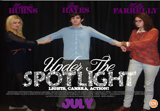
¢Image 2 shows my image on landscape format for the first time.
¢I have also changes the style of my actors and actresses names at the top of the page. I have done this because when researching film posters, I noticed that it was normally the surname that stood out the most and was bigger than the first name. I also noticed that the surname was always in a bold font whereas the first name was often more subtle, smaller and in a nicer font.
¢Also, I have developed the creation of my film name and I did this by searching through websites such as http://www.dafont.com/ and http://www.fontspace.com/category/magazine . These websites were really useful because they allowed me to create fonts and use colours that I wouldn’t have been able to use on publisher, which is what I was creating my film poster on. I really like the style use for ‘SPOTLIGHT’ as I think the stars in the name are really effective because it gives an insight into the title of the film and why it is called what it is and this then alludes to what the film might be about and what the storyline might entail.
¢I have also started to construct my small font that includes all the actors and actresses names, the directors, the producers, all the people that have worked on the film and the production company that the film is associated with. I managed to create my own by researching what is included in the small text on existing film posters and we also have some posters on the walls in the media room and so I looked the these for inspiration and research which really helped.
¢In the third image, I have taken off the certificate that was in the second image. I have done this because me and my teacher discussed and decided that the film poster would look better without it because it was distracting from the film poster itself and the message it was portraying. I was encouraged to do this because I noticed that some romantic comedy film posters also don’t incorporate the certificate either.
¢I have also changed when the film is coming out from ‘July’ to ‘In Cinemas July’. I have decided to this because my media teacher advised it would be better to put ‘in cinemas’ and I agreed with her because then my audience will know exactly when it is in cinema rather than just saying ‘July’ and so using ‘In Cinemas’ certifies when the film is actually coming out.
¢I have finally added comments from pundits and those who have already seen the film and reviewed it. I added comments such as ‘Best Film of the year!’ because I found this to be quite common when researching film posters. Also, the audience will see the others have seen the film and really enjoyed it, which could persuade and lure them in to go and see it.


No comments:
Post a Comment