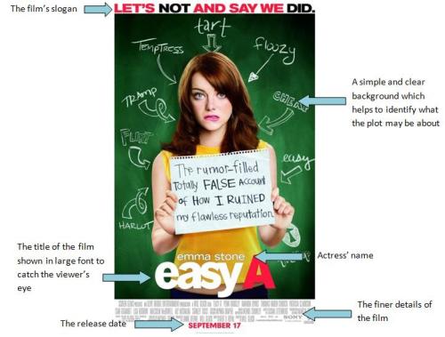
Similar to the posters analysed below this poster has a simple background, a slogan, the name of the protagonist, a large title and a release date.It is obvious to see from the background that the film is a comedy and obviously centres around a girl in a school, as depicted by the traditional blackboard used as the background. The piece of paper the girl is holding also clearly gives a suggestion of what the film is going to be about. At the top of the poster is a slogan in a bold red font which clearly reflects something to do within the film. Above the once again large title of the film is the actress’ name; obviously a very key feature. Similarly, the details of the director and editor and so on are placed in small font at the bottom of the poster, with the release date in clear red font enabling it to stand out from its background.
From analysing these three posters it is clear to see that there are many conventions:
- A clear and simple background, usually a posed photo of the protagonists which helps to highlight the character’s personalities and reveals hints about the plot of the film
- The names of the actors and actresses are clearly shown above the images of their characters
- The title of the film is often in a very large and bold font so that it stands out from the background
- There is sometimes a slogan/tag line, again giving an insight into the film
- The release date of the film into cinemas is clearly shown
- There is information about the film company, the director, the editor and so on
No comments:
Post a Comment